Mirelo.ai
Date: July 2025
B2C, SaaS, AI, Onboarding
UX Optimization, Iterative Design, User Testing, Prototyping


Mirelo: From Confusion to Confidence

A Powerful Product Nobody Could Use
The Real Probem Was Hidden
End-to-End Ownership
Three Onboarding Paradigms

Testing Led to Clarity
What Testing Revealed
Option A (Pre-editor wizard) was engaging but introduced unnecessary friction before users saw value
Option B (Guided within editor) overwhelmed users too soon with simultaneous choices
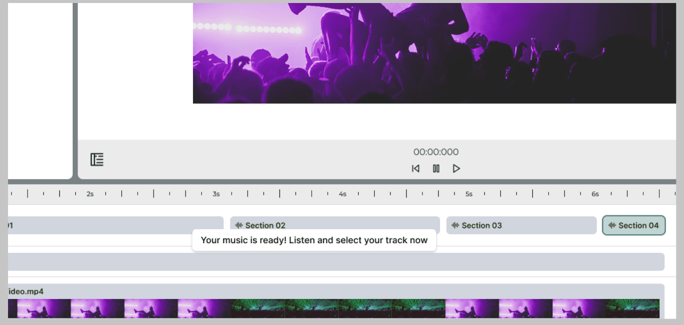
Option C (Auto-generation) delivered immediate value with minimal cognitive load
The Insight
Users didn't need more control upfront, they needed to experience the product's value first. Auto-generation removed the decision burden and let the product speak for itself.
The Auto-generation flow emerged as the clear winner. I iterated it into high fidelity, refining microcopy and visual cues to ensure the experience felt helpful and empowering but never condescending. The result was an onboarding journey designed to reach the "aha" moment as fast as possible.
Results That Moved the Business
40%
Dropoff Reduction
More first-time users completed a full session, uploading, generating, and downloading directly unlocking revenue.
25%
Week 1 Retention Lift
A strong first experience built confidence and habit, driving significantly higher continued engagement.
65%
A component-based, annotated design system was delivered for onboarding establishing a scalable, reusable pattern for introducing future complex features.
Mirelo Became Part of the Workflow
Users trust Mirelo to be easy and flexible on their projects. They return again and again as it becomes an essential part of their workflow.
Value Unlocked
By reaching the "aha" moment faster, users experienced the product's core power on session one, converting skeptics into advocates.
Scalable Foundation
The design system delivered enables the engineering team to introduce future complex features with the same clarity and confidence.
The Win Was the Thinking
This project demonstrated that in a deep-tech product, user empowerment is not about simplification, it's about clarity of path. By designing a guided journey to the "aha" moment, we turned initial confusion into confident, long-term engagement.