Design System
Date: Aug 2025
AI Product, B2C
UI, Design Systems


Mirelo Design System: Scaling Product and Team Efficiency
From fragmented UI to a unified design & dev bridge, reducing handoff time by ~50% and prototyping time by 30% at an AI startup
From fragmented UI to a unified design & dev bridge, reducing handoff time by ~50% and prototyping time by 30% at an AI startup
Context & Challenge
When I joined Mirelo.AI the company was experiencing the classic growing pains of a fast-moving startup. While the engineering team had adopted Tailwind CSS for development efficiency, there was no centralized design source of truth. Design files were scattered, UI components were inconsistently implemented across the webapp and marketing site, and every new feature required designers and engineers to rediscover or reinvent basic elements like buttons and typography.
The core problem: Our velocity and product cohesion were being bottlenecked by foundational design debt. We needed a single source of truth to align design and engineering, speed up iteration, and ensure a consistent user experience as we scaled.


My Role & Strategic Approach
I owned the end-to-end creation of Mirelo’s first design system to unify design and development.
I owned the end-to-end creation of Mirelo’s first design system to unify design and development.
Securing Buy In: Presented a business case to founders framing the system as critical infrastructure for speed and consistency, which unlocked the official Figma team.
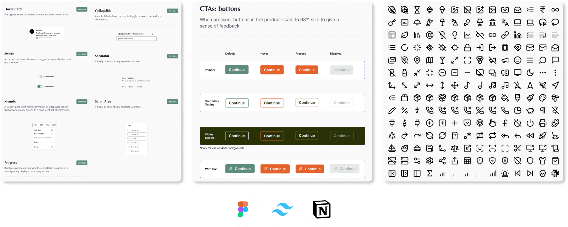
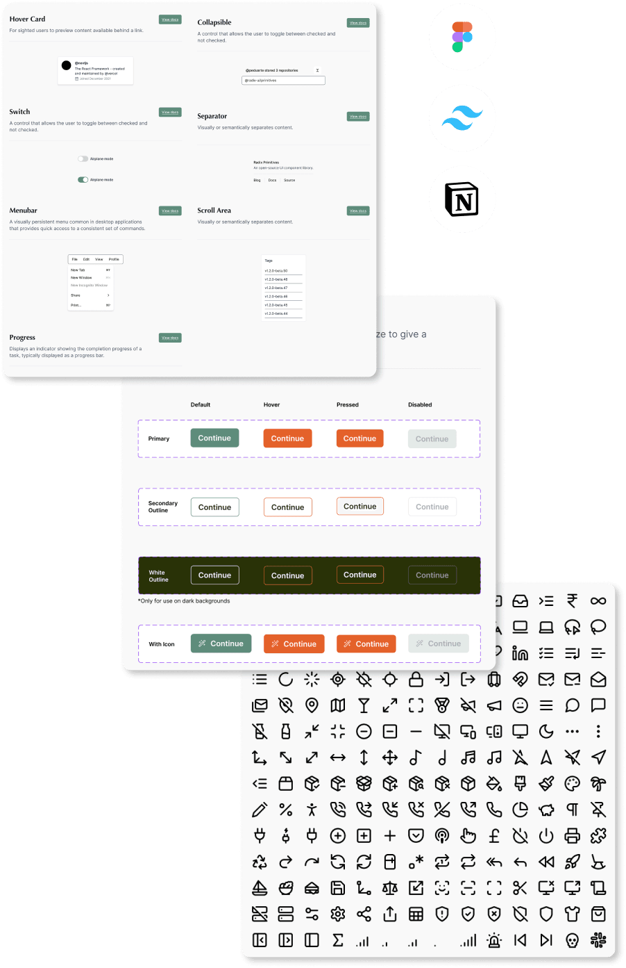
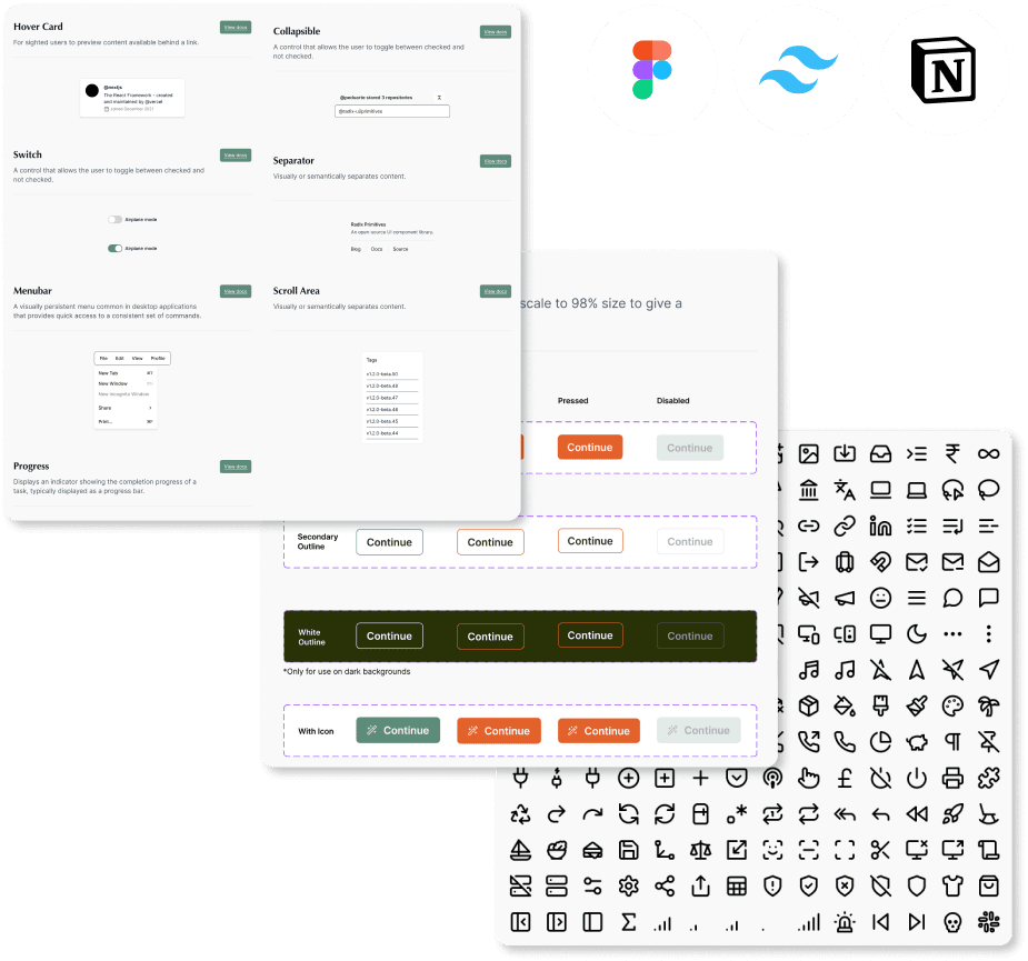
Building Foundations: Audited all product UI to define and build core Figma tokens: Typography, Semantic Color Palette, Grid/Spacing, and Interactive Components (Buttons, Inputs).
Creating Primitives: Expanded the library into reusable, composable primitives (Icons, Form Elements, Feedback Indicators) using auto layout and variant properties.
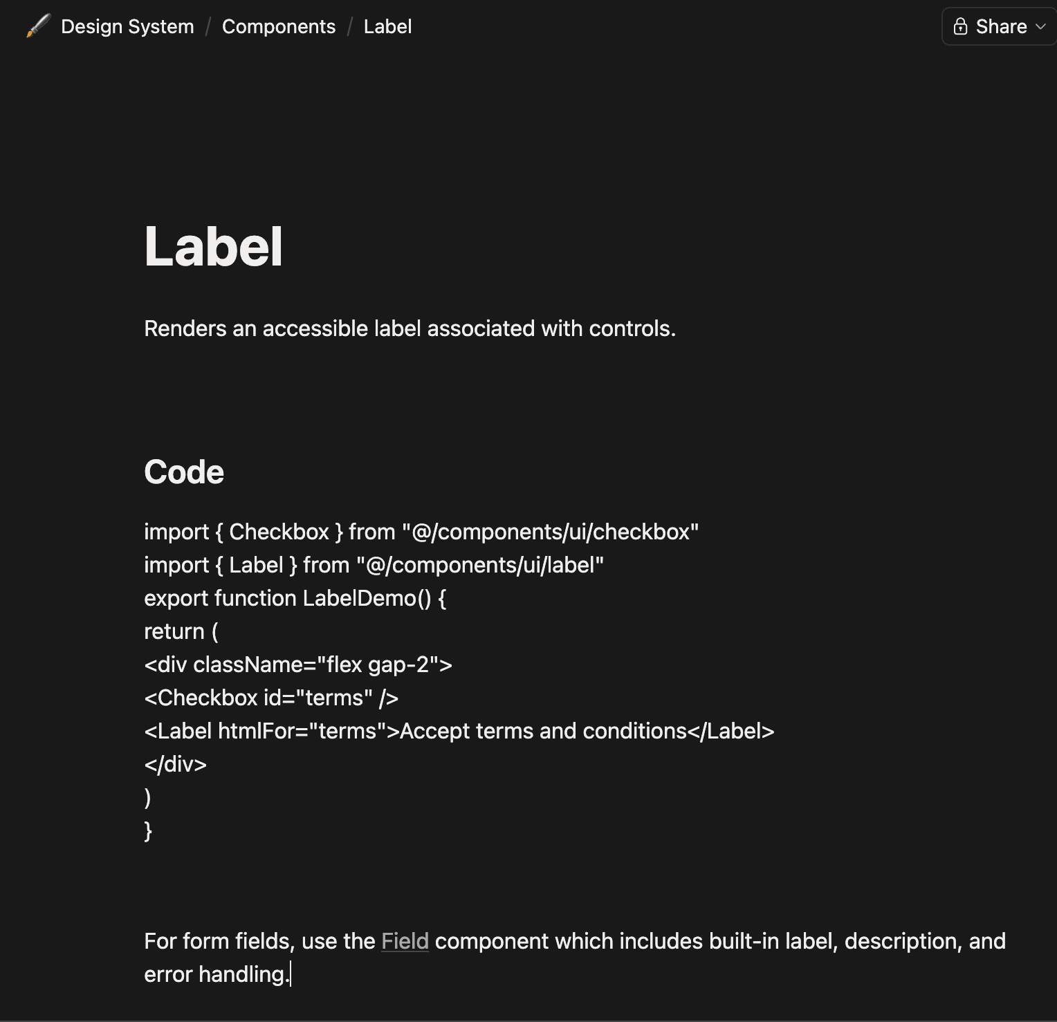
Documenting for Adoption: Built a central Notion hub with principles, component specs, and direct Tailwind CSS class mappings for engineers.
Establishing Governance: Instituted a lightweight process where new features trigger systematic updates, ensuring the system evolves with the product.
Securing Buy In: Presented a business case to founders framing the system as critical infrastructure for speed and consistency, which unlocked the official Figma team.
Building Foundations: Audited all product UI to define and build core Figma tokens: Typography, Semantic Color Palette, Grid/Spacing, and Interactive Components (Buttons, Inputs).
Creating Primitives: Expanded the library into reusable, composable primitives (Icons, Form Elements, Feedback Indicators) using auto layout and variant properties.
Documenting for Adoption: Built a central Notion hub with principles, component specs, and direct Tailwind CSS class mappings for engineers.
Establishing Governance: Instituted a lightweight process where new features trigger systematic updates, ensuring the system evolves with the product.
Core System Principles
We built Mirelo’s design system around three principles:
1
Single source of truth – One place for every UI decision, no more scattered files.
2
Dev-ready by design – Every component mapped directly to Tailwind classes.
3
Evolving – Start lean, add components only when needed, update systematically.
Building the Foundations (The Atomic Layers)
Design tokens
Typography scale (5 heading levels, body, small, code)
Semantic color palette (primary, neutral, success, warning, error, with Tailwind shadings)
Spacing grid (based on 4px / 0.25rem)
Border radius + shadow tokens
Components
Buttons (primary, secondary, outline, ghost, destructive, all sizes + states)
Form inputs (text, select, checkbox, radio, with validation)
Feedback indicators (toast, alert banner, spinner, skeleton)
Navigation elements (tabs, breadcrumbs, pagination)
Patterns
Data loading flow (skeleton → empty state → error → content)
Form validation (inline + summary)
Modals and drawers (with animation specs)


Documentation & Collaboration
Tools: Figma (design source of truth) + Notion (living documentation hub) + Tailwind CSS (dev implementation)
How I structured the Figma file:
Cover page: “Welcome to Mirelo’s design system, start here”
Tokens page (designers can copy/paste)
Components page (with usage guidelines, not just UI)
Patterns + templates
Handoff rituals:
Direct Tailwind class mapping inside Notion so engineers copy code, not guess
Weekly 15-min design&dev sync to review system additions
One pager: “When to create a new component vs. use existing”

Impact & Results
The implementation of the Mirelo Design System transformed our product development workflow from fragmented to streamlined.
30% faster prototyping & iteration – Designers (and later, new hires) could assemble high-fidelity, consistent mockups in hours instead of days by pulling from the trusted library.
Improved developer handoff by ~50% – Engineers no longer needed to pixel check or guess specifications. Handoffs became a conversation about logic and behavior, not visual corrections. The direct Tailwind class mapping eliminated translation errors.
Achieved visual consistency across the product suite – The web app, landing pages, and internal tools began speaking the same visual language, strengthening brand recognition and user trust.
Built a scalable foundation for growth – The system was no longer a static project but a product itself. It provided a structured, low-friction path for the team to introduce new features and for the company to scale the product team without sacrificing quality or velocity.


Challenges & Learnings
Challenge 1: Overbuilding early
I initially created 6 button sizes. After two sprints, only 3 were used. I learned to build components just-in-time, not just-in-case.
Challenge 2: Balancing startup speed vs. system purity
Some features needed quick, one-off UI. I created a clear rule: “If a UI element appears twice, it becomes a component.”
Challenge 3: Gaining dev buy-in
Engineers were skeptical of “another design thing.” The turning point was the Tailwind class mapping, they saw it saved them work, not added to it.
Next Steps
Dark mode system – Tokens already structured to support a
dark:variant in TailwindComponent adoption analytics – Track which components are used (or ignored) in Figma
Open contribution model – Engineers can propose new components with a simple template
Versioned release notes – So teams know when a component updates
Reflection & Takeaways
This project demonstrated that a design system’s greatest value is operational. By building the bridge between Figma and Tailwind and embedding the system into our process, I turned a tactical UI cleanup into a strategic asset that accelerated the entire product organisation.
What I’d do differently next time:
Start with even fewer components (just buttons, inputs, cards) and let usage drive expansion
Measure developer time saved earlier (I initially only tracked design metrics)
Final thought:
A design system at a startup isn’t about perfection. It’s about reducing friction between design and engineering, one component at a time.