Botaniola
Date: Jan 2026
0-1 Product, SaaS, Personal project
Product Design, Vibe coding, Prototyping, Branding


Botaniola: Designing & Building a Plant Care Companion
I kept killing my plants, not from neglect but from inconsistent care. I'd remember to water for two weeks, then forget for ten days. Existing plant apps required manual logging (tap 47 times to record a watering) or were bloated with social features I didn't want. I needed something simple: a way to see all my plants, their watering needs and a schedule that fit how I actually think i.e. by room, by visual recognition, or by glanceable calendar.
Botaniola represents how I want to work: designing with empathy for the user, then building to validate and refine. It's not just a concept, it's a real tool I use every week. That's the kind of ownership and execution I bring to product design.
Try it out here: https://botaniola-app.lovable.app
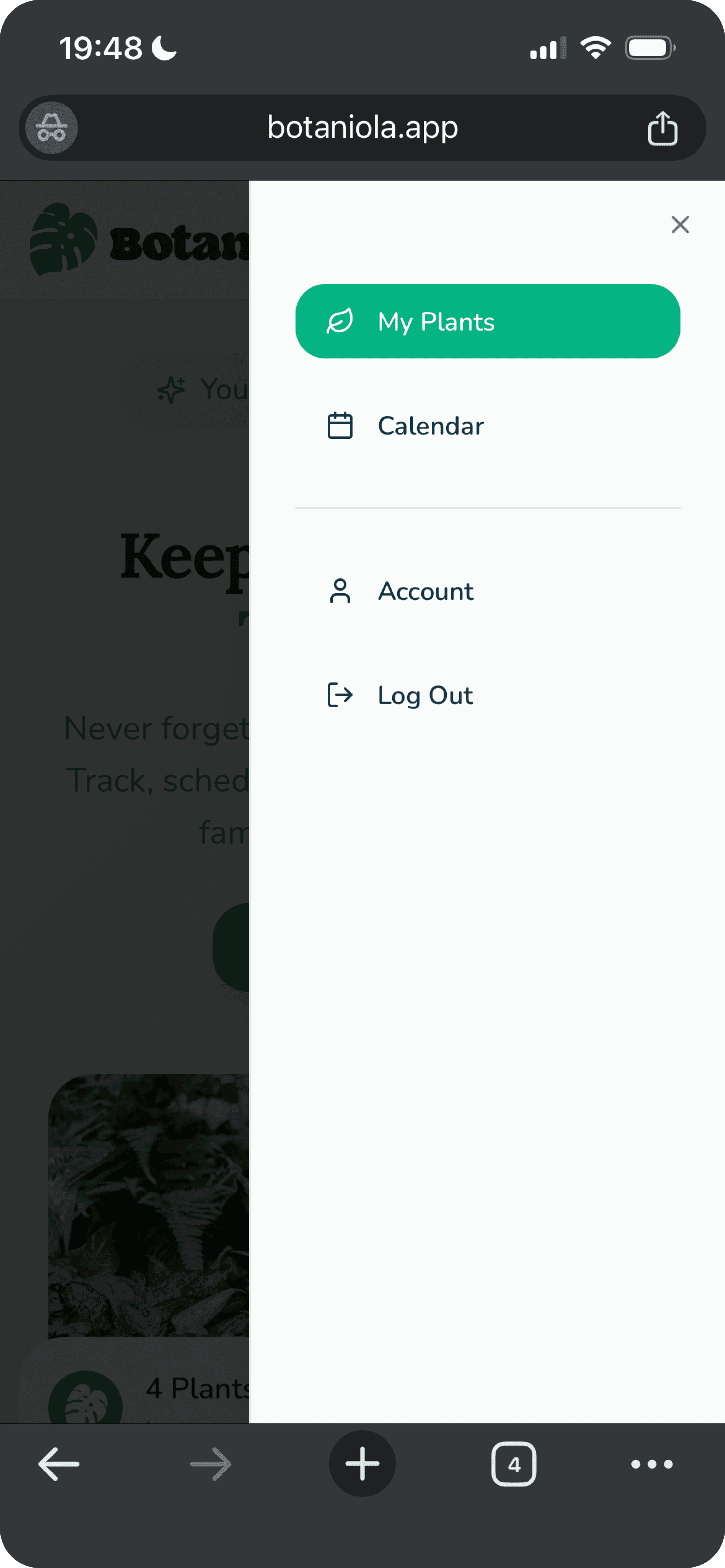
Discovery & User Flow
I started by mapping how I actually think about plant care:
Open app →
See all plants at a glance →
Filter by room (bathroom plants need different humidity) →
Check calendar (what needs water today/tomorrow) →
Add new plant (photo + name + room + schedule) →
Edit/remove plants as they grow (or… don't)
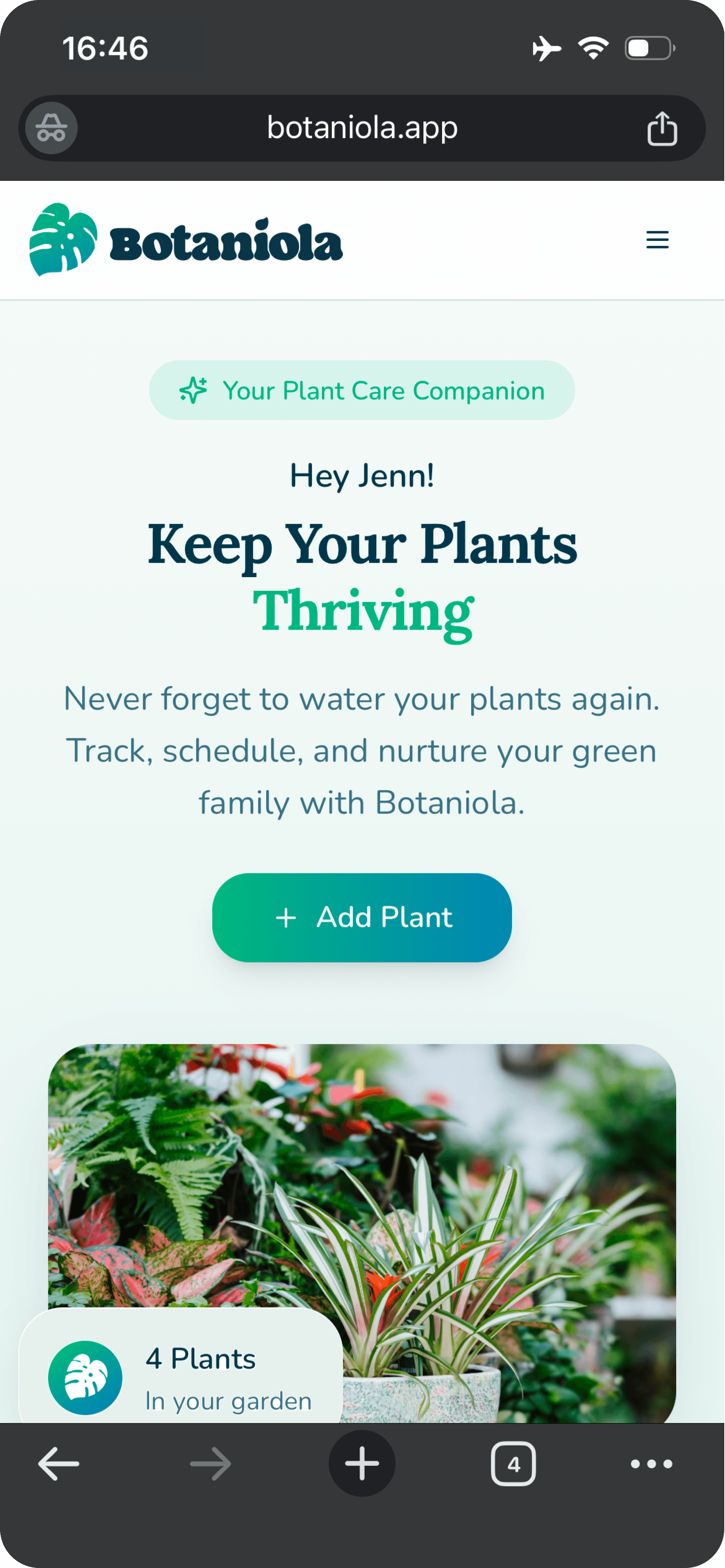
Key insight: Plants are visual. I recognise my plants by their leaves, not their names so the UI needed to be photo first.
I started by mapping how I actually think about plant care:
Open app →
See all plants at a glance →
Filter by room (bathroom plants need different humidity) →
Check calendar (what needs water today/tomorrow) →
Add new plant (photo + name + room + schedule) →
Edit/remove plants as they grow (or… don't)
Key insight: Plants are visual. I recognise my plants by their leaves, not their names so the UI needed to be photo first.
Information Architecture
I organised around two mental models:
Spatial (by room) – because I walk through my apartment room by room with a watering can
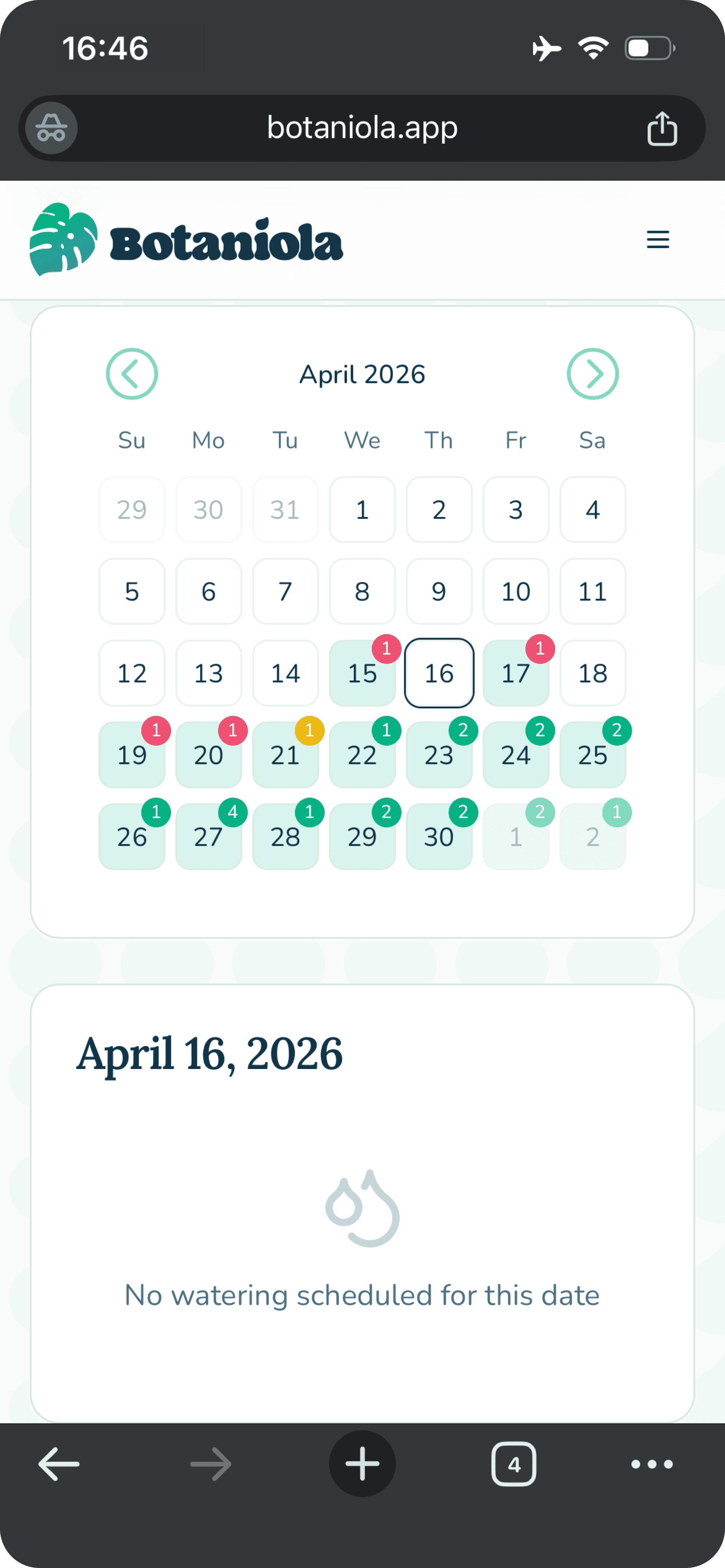
Temporal (by calendar) – because I think in weeks, not abstract intervals
The dashboard prioritizes the photo grid (spatial). The calendar tab handles the temporal view.
I organised around two mental models:
Spatial (by room) – because I walk through my apartment room by room with a watering can
Temporal (by calendar) – because I think in weeks, not abstract intervals
The dashboard prioritizes the photo grid (spatial). The calendar tab handles the temporal view.
Visual Design
Visual Design
Mood & tone: Calm, warm, slightly botanical but not precious. This is a utility, not a meditation app.
Typography:
Headings: Lora – serif, floral and balanced
Body: Nunito – rounded, friendly
Component design:
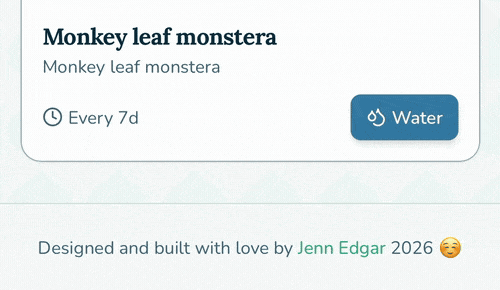
Plant cards: dominant photo, minimal text overlay (name, room), subtle shadow for depth
Schedule picker: simplified to common intervals (every X days) + custom option
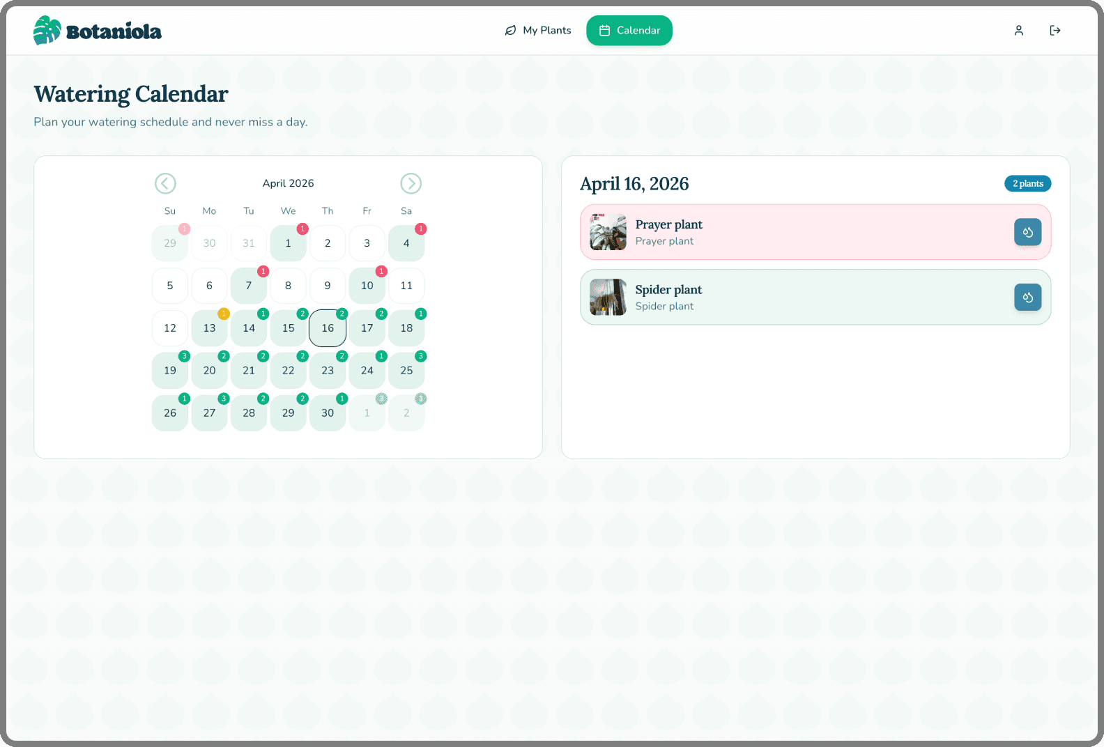
Calendar: dots indicate scheduled watering, filled dots when completed
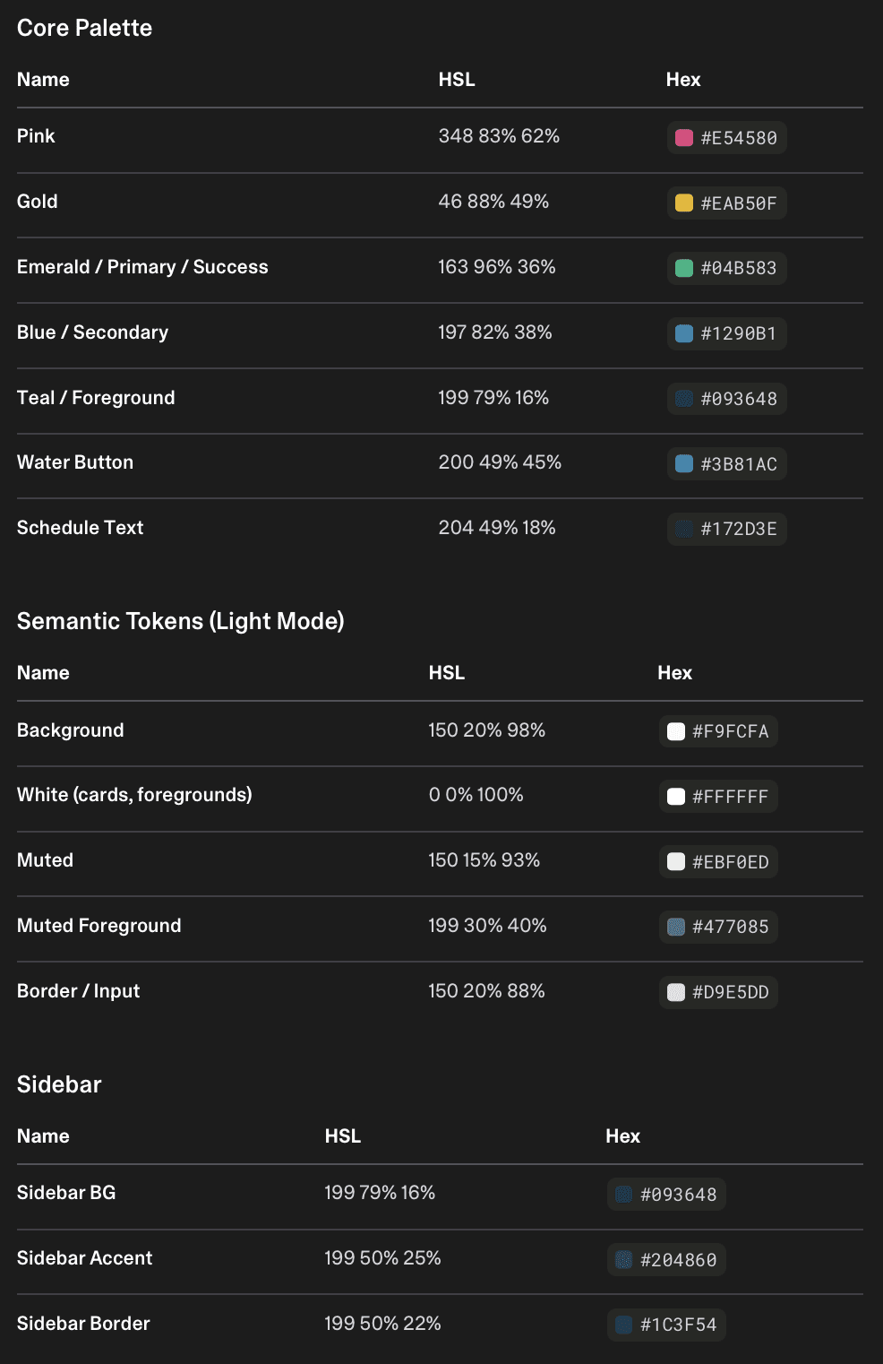
Color palette:
Mood & tone: Calm, warm, slightly botanical but not precious. This is a utility, not a meditation app.
Typography:
Headings: Lora – serif, floral and balanced
Body: Nunito – rounded, friendly
Component design:
Plant cards: dominant photo, minimal text overlay (name, room), subtle shadow for depth
Schedule picker: simplified to common intervals (every X days) + custom option
Calendar: dots indicate scheduled watering, filled dots when completed
Color palette:
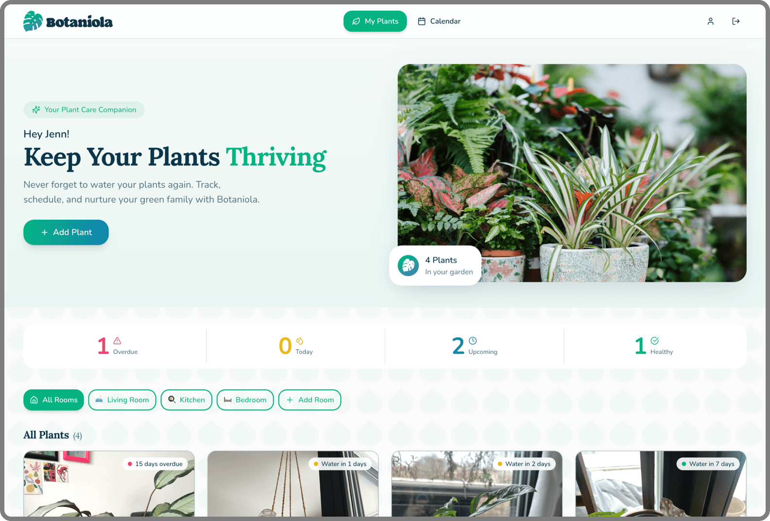
Key Design Decisions
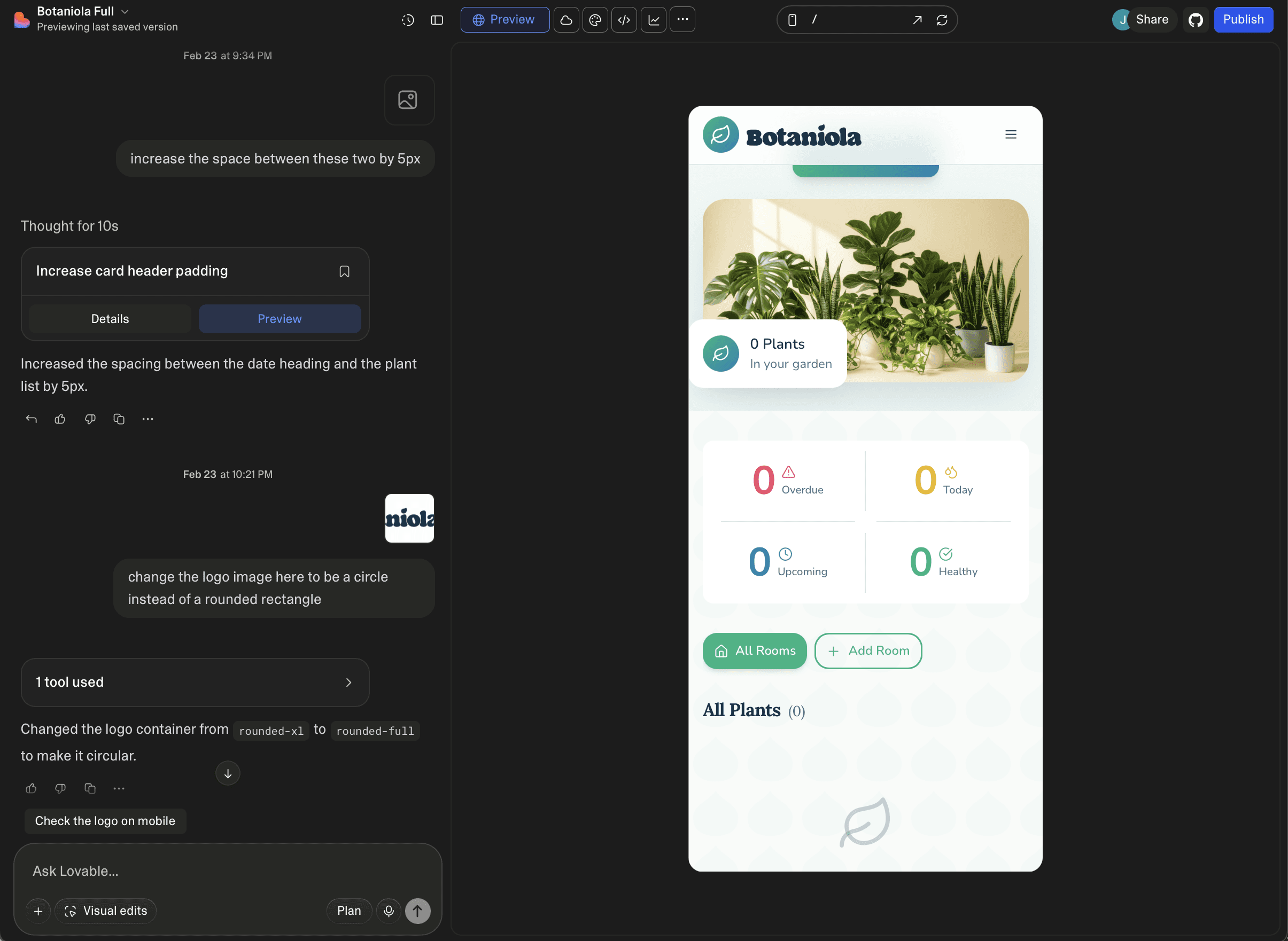
Photo-first grid
I tried name first layouts, but I found myself reading instead of recognising. The photo grid lets you scan instantly 'oh, the snake plant needs water' without parsing text. It mirrors how you'd look at your actual plant shelf.
Room sorting
Grouping by room turned out to be the killer feature in testing. Plant parents often water in batches, everything in the bedroom at once. This simple sort matches real world behavior.
Calendar as primary reminder
Push notifications are intrusive. The calendar is ambient awareness. Open it once a week, see what's coming up and plan your watering day. It's lower stress and builds a routine.
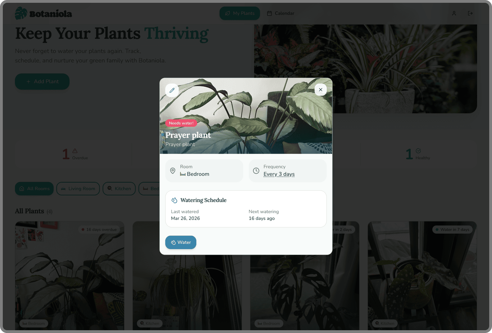
Minimal edit/delete
Plants die, get repotted and renamed. Plants get gifted. The edit flow is one tap away, no hidden menus. Respect the user's reality.
The water sprinkle moment
Watering a plant should feel satisfying, not like clicking a button in a spreadsheet. When you tap 'water' on a plant card, a gentle sprinkle animation plays across the screen. It's micro feedback that turns a utilitarian task into a small moment of joy.
Photo-first grid
I tried name first layouts, but I found myself reading instead of recognising. The photo grid lets you scan instantly 'oh, the snake plant needs water' without parsing text. It mirrors how you'd look at your actual plant shelf.
Room sorting
Grouping by room turned out to be the killer feature in testing. Plant parents often water in batches, everything in the bedroom at once. This simple sort matches real world behavior.
Calendar as primary reminder
Push notifications are intrusive. The calendar is ambient awareness. Open it once a week, see what's coming up and plan your watering day. It's lower stress and builds a routine.
Minimal edit/delete
Plants die, get repotted and renamed. Plants get gifted. The edit flow is one tap away, no hidden menus. Respect the user's reality.
The water sprinkle moment
Watering a plant should feel satisfying, not like clicking a button in a spreadsheet. When you tap 'water' on a plant card, a gentle sprinkle animation plays across the screen. It's micro feedback that turns a utilitarian task into a small moment of joy.
Building It (The Vibe Coding Layer)
I didn't want Botaniola to live only as mockups. I wanted to use it to validate whether my design decisions actually worked in practice.
Using Lovable, I built a fully functional version of Botaniola. This wasn't about learning to code; it was about designing in the medium of a working product.
What building enabled:
Design Assumption "Photos will auto-crop nicely"
Reality (After Building) Some plants got cropped at the stem
Iteration Added manual crop adjustment before save
Design Assumption "Text on photos looks clean"
Reality (After Building) Unreadable in bright sun or with dark plant photos
Iteration Added semi-transparent overlay behind text
The result: A design that evolved through actual use, not just critique.
I didn't want Botaniola to live only as mockups. I wanted to use it to validate whether my design decisions actually worked in practice.
Using Lovable, I built a fully functional version of Botaniola. This wasn't about learning to code; it was about designing in the medium of a working product.
What building enabled:
Design Assumption: "Photos will auto-crop nicely"
Reality: (After Building) Some plants got cropped at the stem
Iteration: Added manual crop adjustment before save
Design Assumption: "Text on photos looks clean"
Reality: (After Building) Unreadable in bright sun or with dark plant photos
Iteration: Added semi-transparent overlay behind text
The result: A design that evolved through actual use, not just critique.
I didn't want Botaniola to live only as mockups. I wanted to use it—to validate whether my design decisions actually worked in practice.
Using Lovable, I built a fully functional version of Botaniola. This wasn't about learning to code; it was about designing in the medium of a working product.
What building enabled:
Design Assumption "Photos will auto-crop nicely"
Reality (After Building) Some plants got cropped at the stem
Iteration Added manual crop adjustment before save
Design Assumption "Text on photos looks clean"
Reality (After Building) Unreadable in bright sun or with dark plant photos
Iteration Added semi-transparent overlay behind text
The result: A design that evolved through actual use, not just critique.
The Features in Action
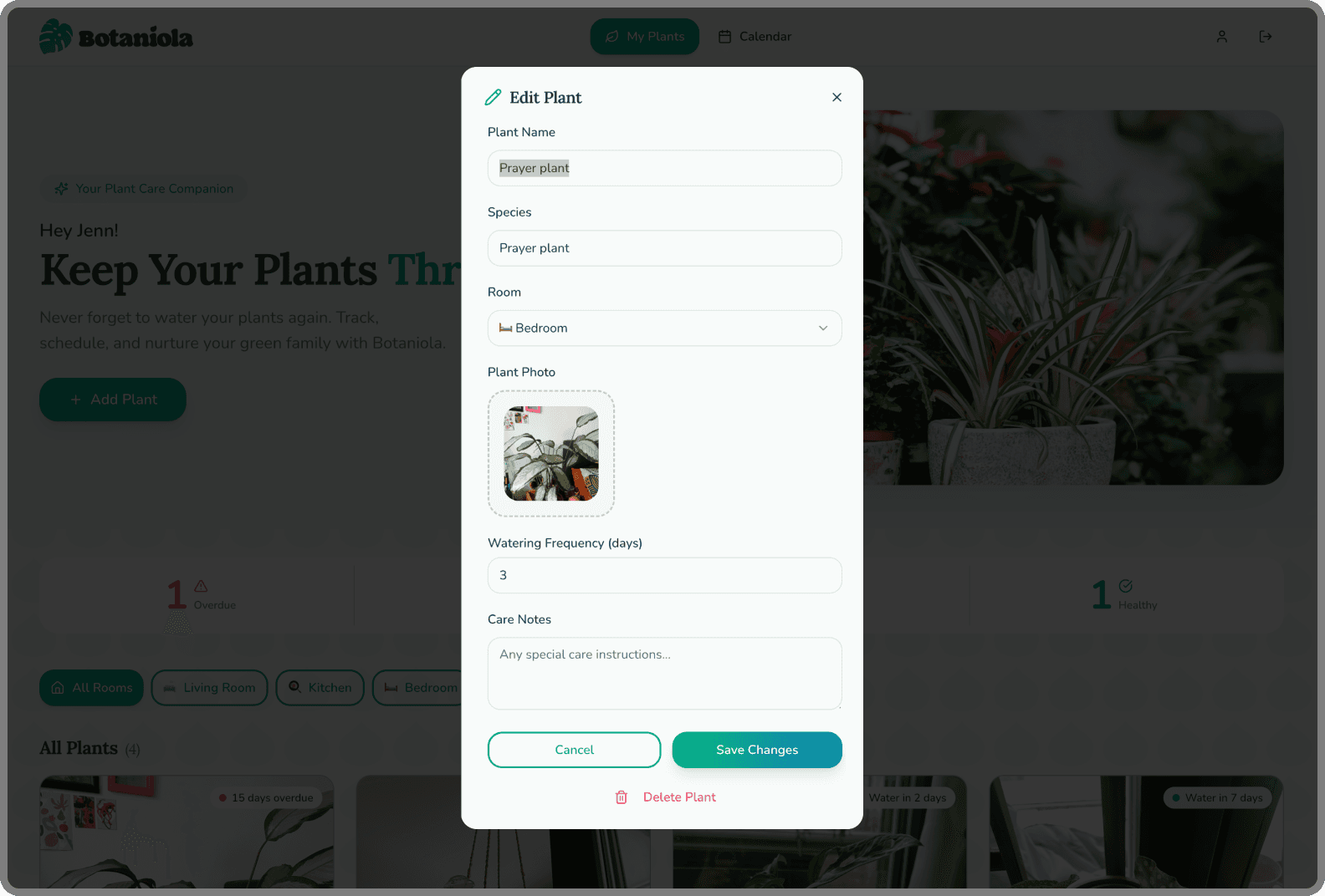
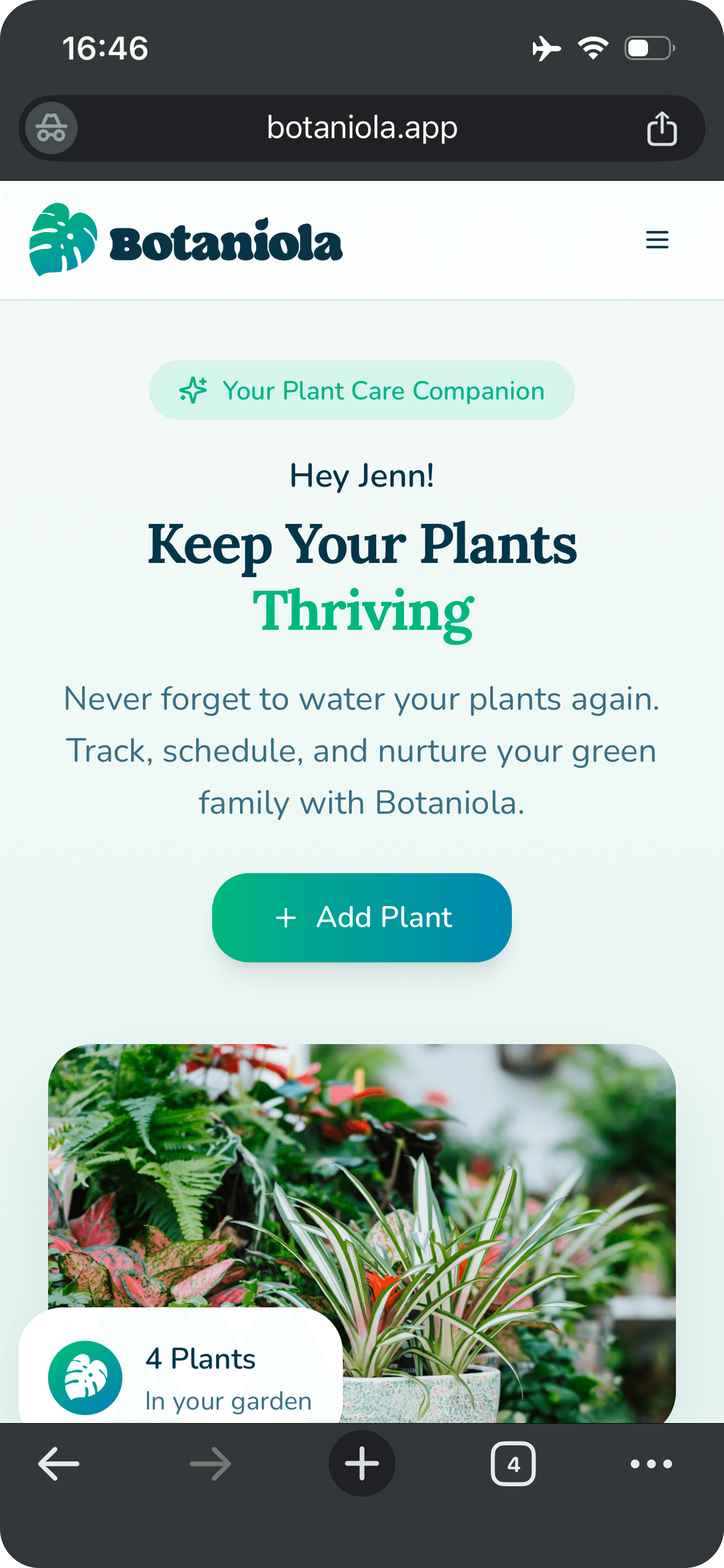
Add a plant
Add a plant
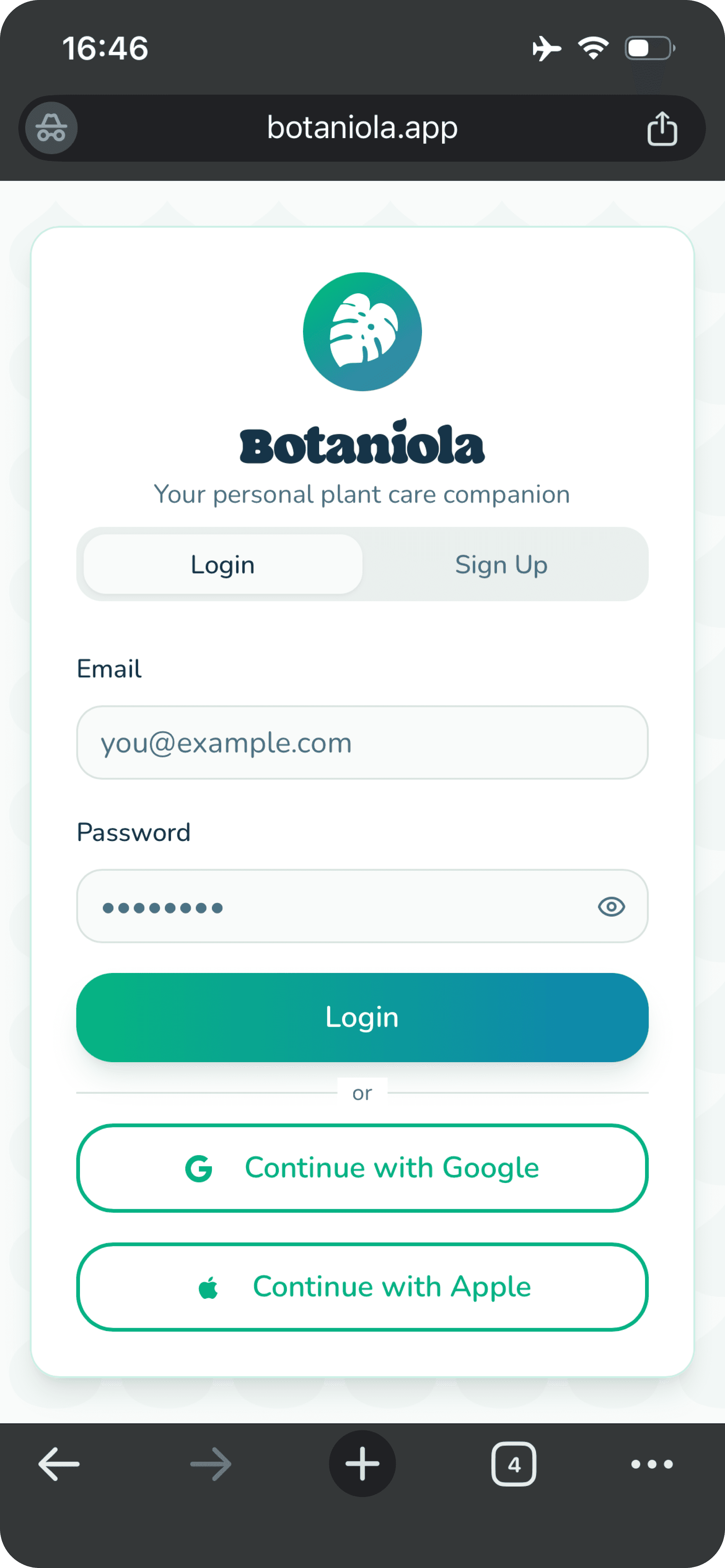
Snap or upload a photo
Name it, assign a room, set a watering schedule
Photo becomes the visual anchor
Snap or upload a photo
Name it, assign a room, set a watering schedule
Photo becomes the visual anchor
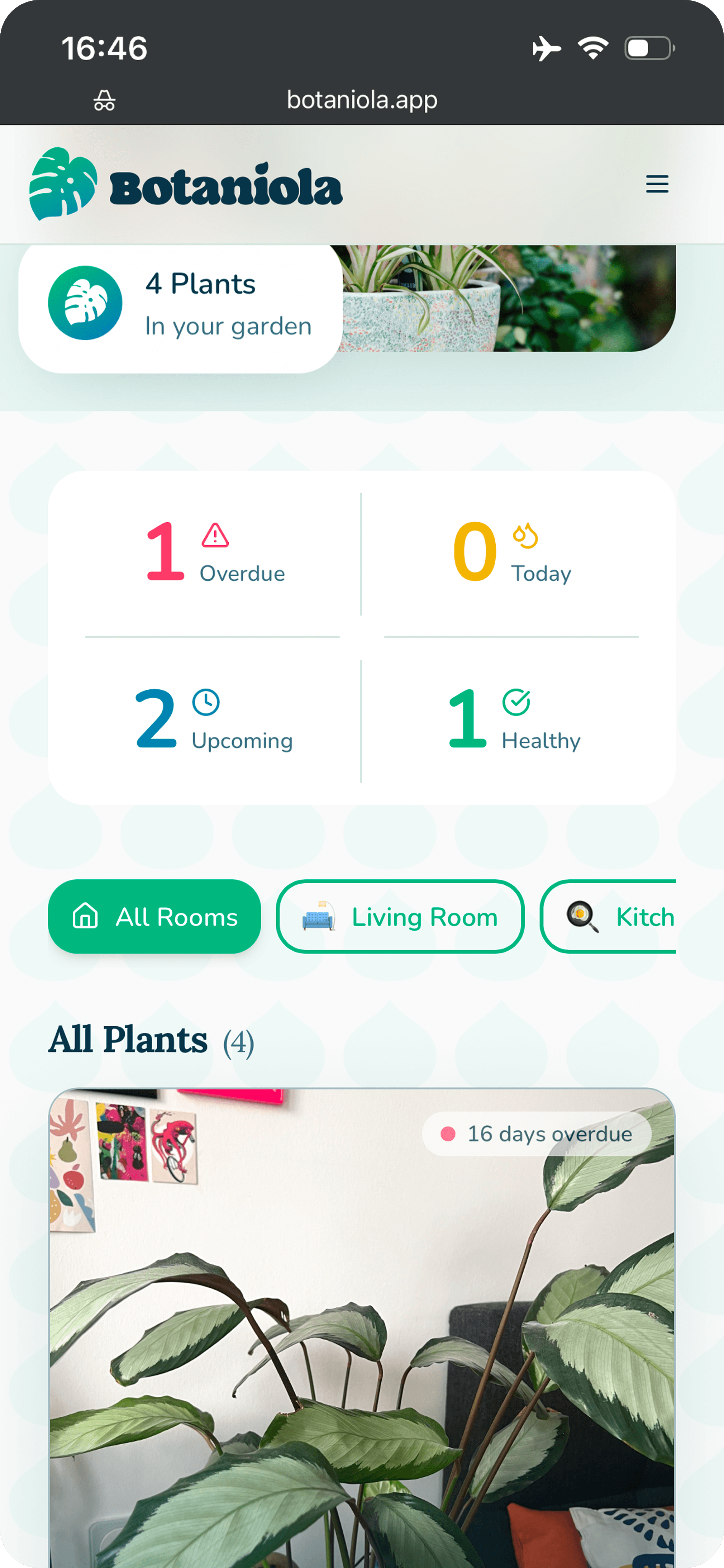
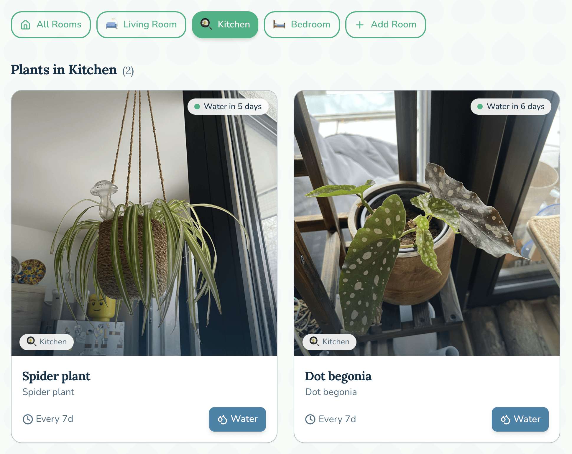
Dashboard
Dashboard
Grid view of all plants with name + room
Sort/filter by room with one tap
Grid view of all plants with name + room
Sort/filter by room with one tap
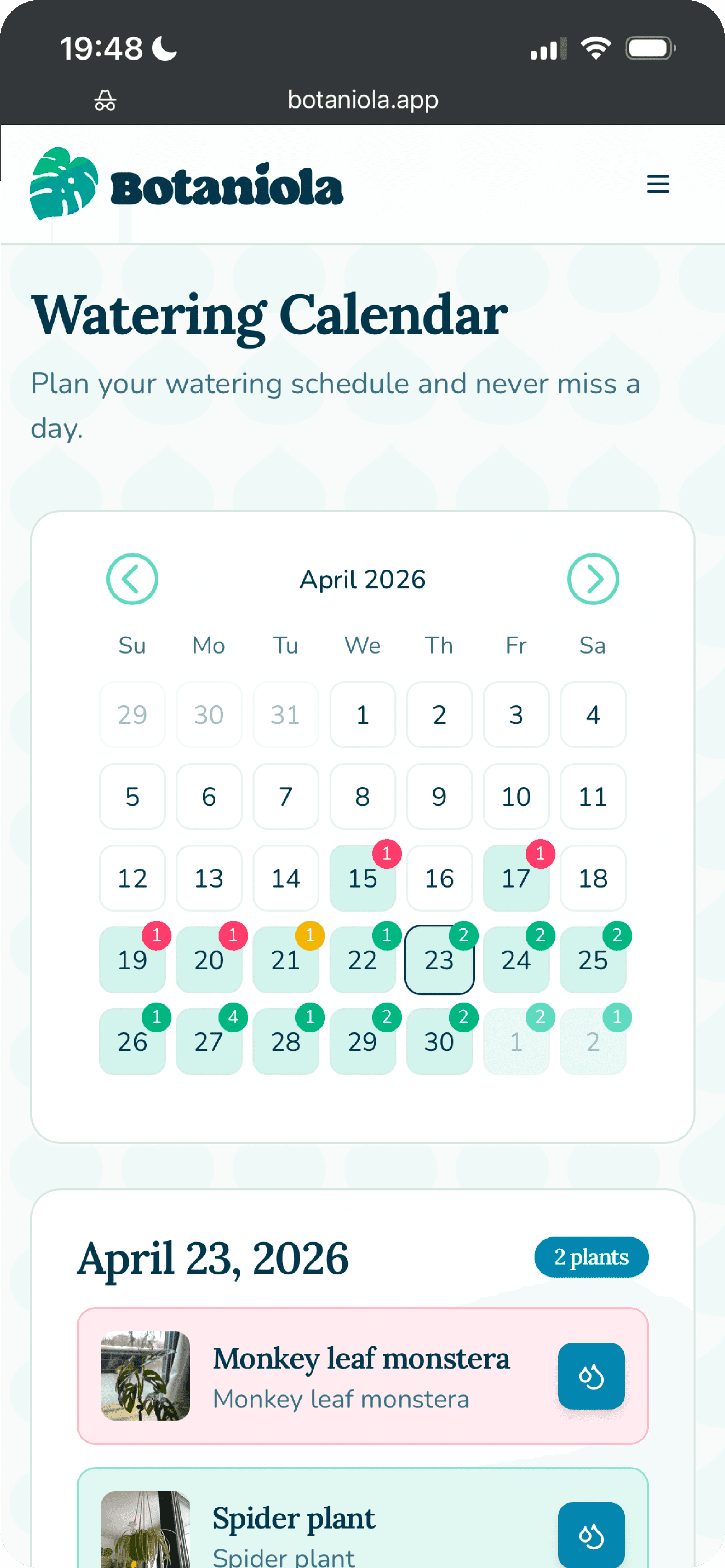
Calendar
Calendar
Monthly view with watering indicators
Tap any day to see which plants need water
Mark complete with one tap
Monthly view with watering indicators
Tap any day to see which plants need water
Mark complete with one tap
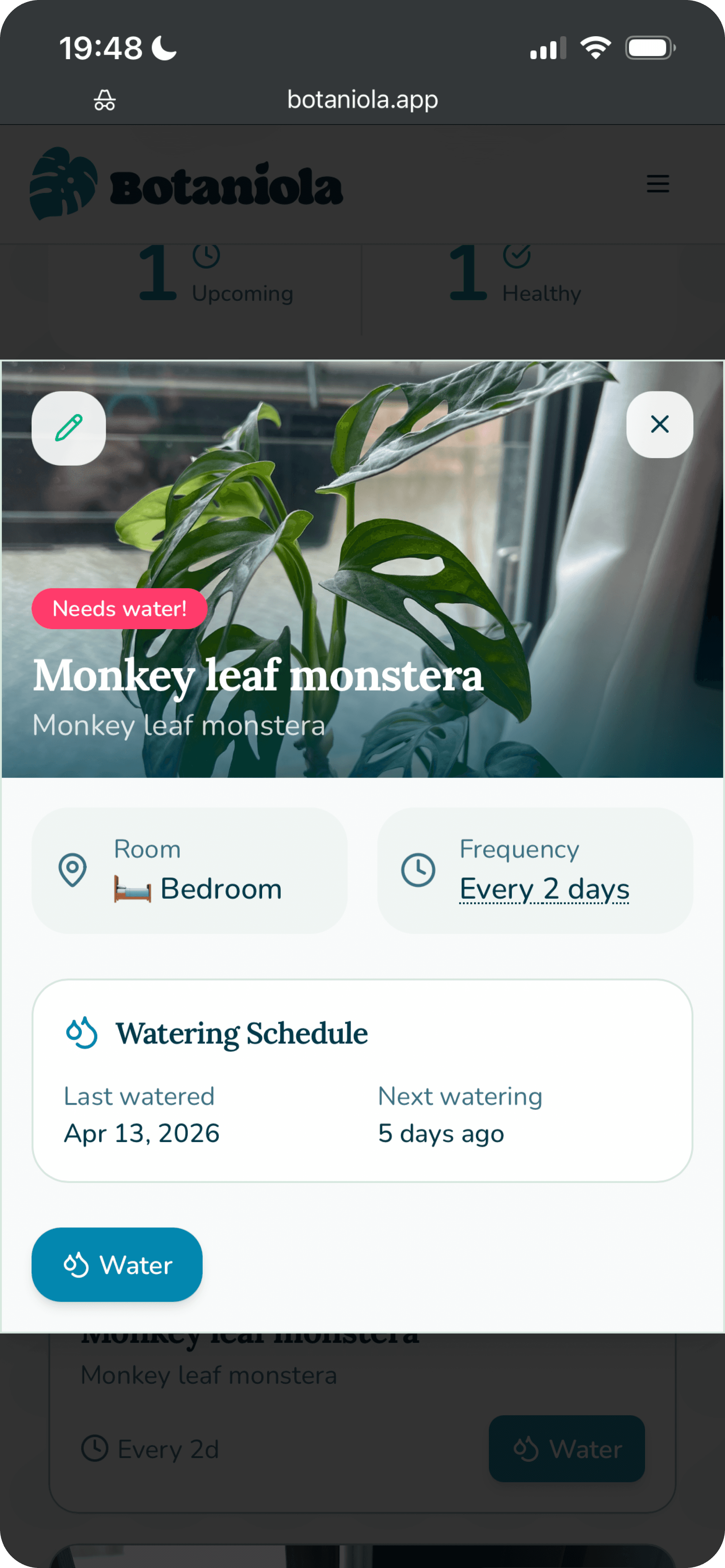
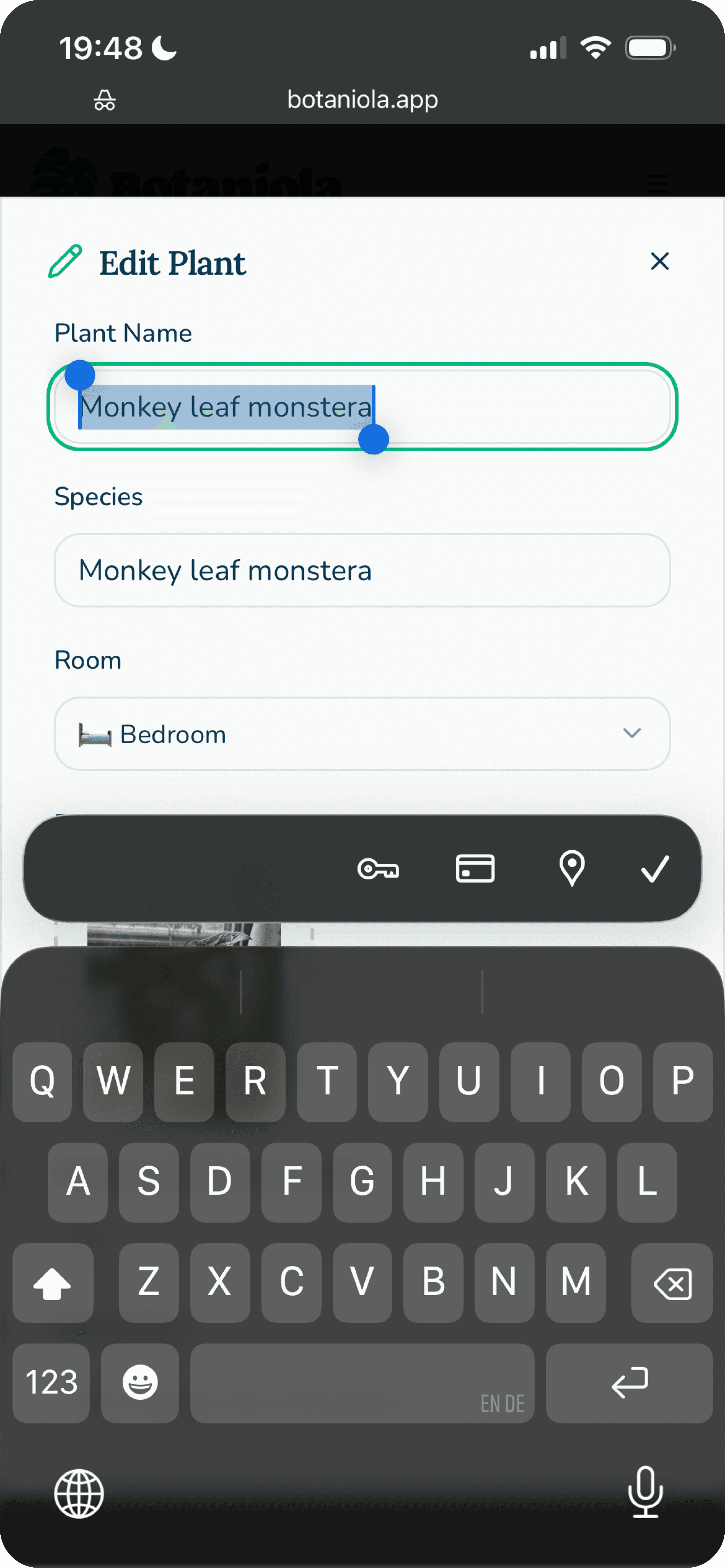
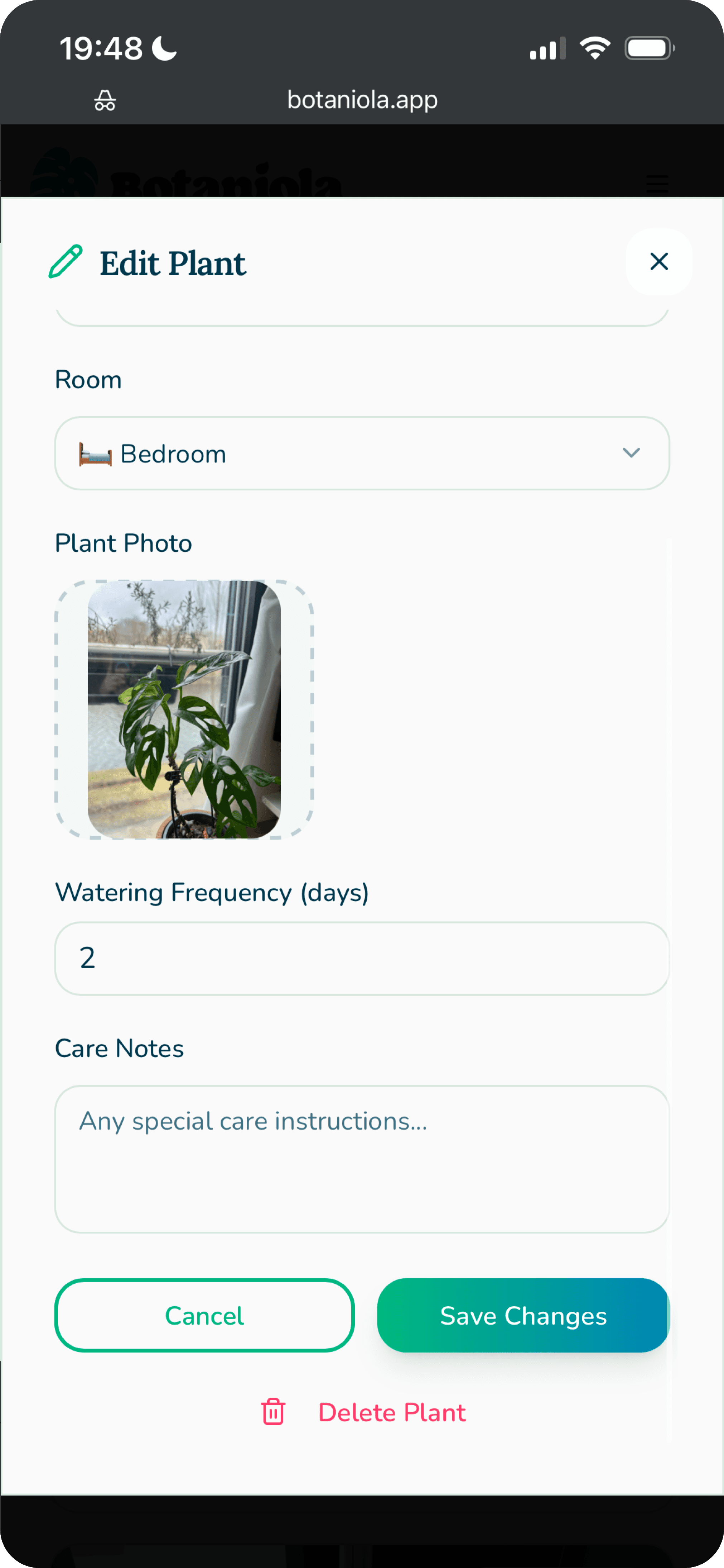
Edit/Delete
Edit/Delete
Tap any plant to update details
Remove plants that have moved on (RIP)
Tap any plant to update details
Remove plants that have moved on (RIP)
Add Plant Flow:
Add Plant Flow:


Lessons Learned
1. Design doesn't end at handoff
I caught interaction issues within hours of using the real app that would have survived weeks of Figma refinement. The feedback loop of a working product is unmatched.
2. Constraints clarify priorities
I wanted moisture tracking, species based tips, and photo growth timelines. Building forced me to ask: 'What's actually essential?' The answer made the product better.
3. Visual design must survive reality
That beautiful low contrast text overlay? Useless in a sunlit room. The app taught me things my eyes in Figma couldn't.
4. I'm a better designer for having built
I now think in states, edge cases, and flows that survive thumbs. Every future design will benefit from this project.
What's Next
Botaniola is currently a working app I use daily. Future plans:
Push notifications (optional, opt-in)
Plant species identification from photo
Care tips based on schedule and type
Shared households for plant responsibilities
Growth timeline (photo history of each plant)
Botaniola is currently a working app I use daily. Future plans:
Push notifications (optional, opt-in)
Plant species identification from photo
Care tips based on schedule and type
Shared households for plant responsibilities
Growth timeline (photo history of each plant)